Axero Digital Workspace
What I Built
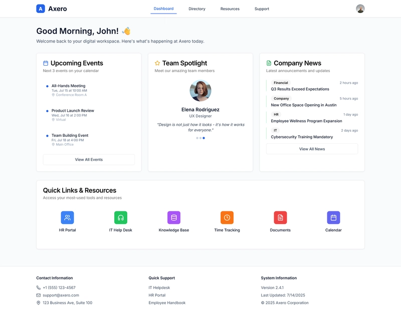
I created Axero Office Space, a modern intranet layout designed to streamline internal communication and enhance productivity. The goal was to build an intuitive dashboard that allows teams to easily access resources—such as corporate news, announcements, team directories, and commonly used documents—in a sleek, responsive interface. Leveraging clean design principles and modular components, I focused on clarity and usability, minimizing clutter while maximizing information accessibility.
Demo
Check out the live project here:
🔗 Axer Office Space on Netlify
You can explore and fork the code directly via the embedded editor below:
(Replace with CodePen, CodeSandbox, or StackBlitz embed to let viewers interact with your code live.)
Journey
🎯 Goals & Vision
- Design a centralized hub where employees can quickly get updates and access critical tools.
- Implement a modular layout that scales with future features—like chat, calendars, or integrations.
- Ensure mobile-first responsiveness, recognizing that many team members may use different devices.
🛠 Tech Stack
- Frontend Framework: (HTML/CSS/JS) for reusable UI components.
- CSS:SCSS, or custom styles) for clean, adaptive layouts.
- Deployment: Hosted on Netlify with instant preview and continuous deployment from Git.
🧭 The Process
- Wireframing: Started with rough sketches to define navigation, content cards, and responsive behavior.
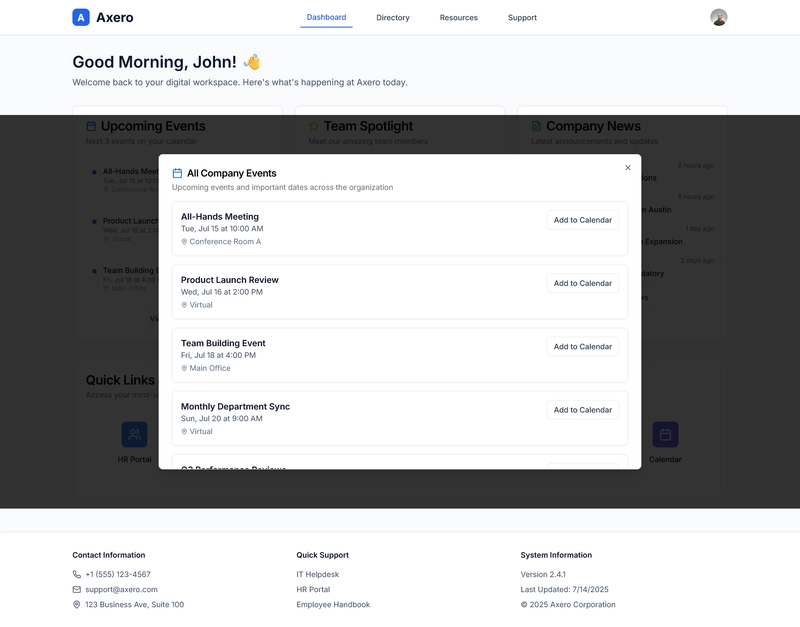
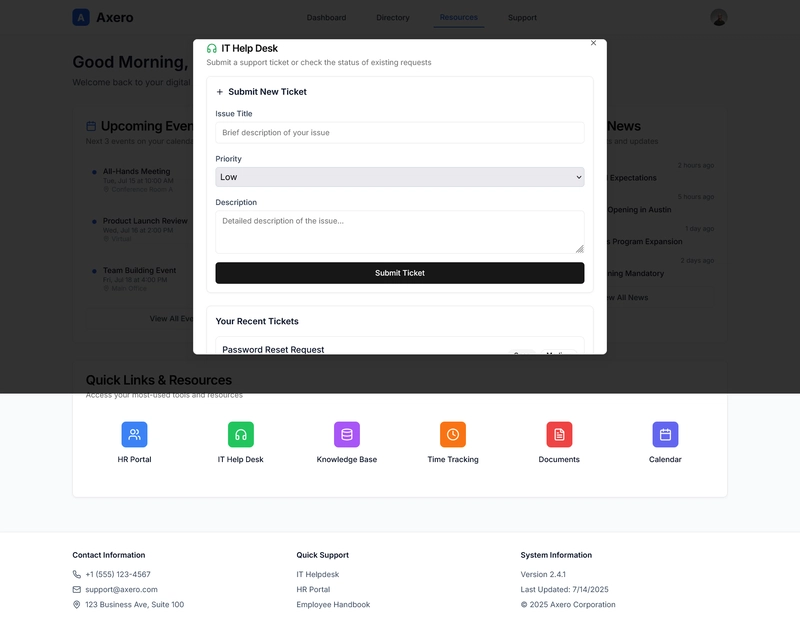
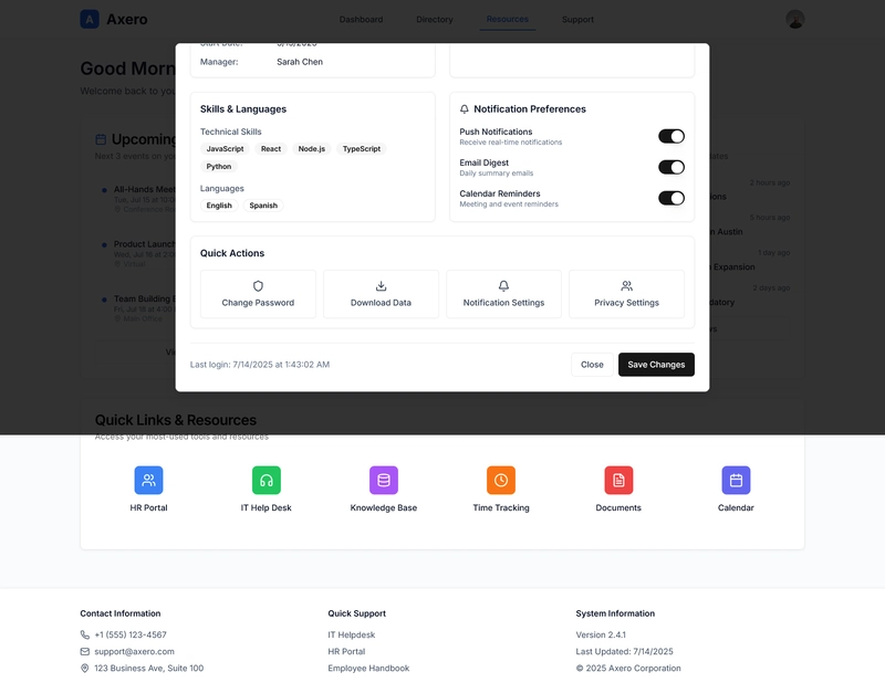
- Component Building: Developed key modules—such as header/nav bar, announcement feed, document tiles, and footer. Emphasized semantic HTML and accessible ARIA attributes.
- Responsive Design: Utilized CSS Grid and Flexbox to ensure smooth adjustments across screen sizes.
- Styling & Theme: Chose a professional palette—muted blues, subtle shadows, and clean typography—to align with typical corporate aesthetics.
- Deployment Workflow: Set up Git-based continuous integration with Netlify for instant build previews and easy rollback.
- Polish & Testing: Conducted real-device testing on desktop, tablet, and mobile. Added hover/focus states and ran Lighthouse audits for performance and accessibility improvements.
🎓 What I Learned
- Modular CSS Architecture: Building self-contained UI blocks made layout maintenance and scalability much easier.
- Netlify Edge Deploys: Deploy previews gave fast feedback from collaborators before pushing to production.
- Responsive Patterns: Handling moderate content density on tight mobile screens taught me smart prioritization of elements.
🏆 Proud Moments
- Seamless navigation with collapsible side menus that adapt based on screen width.
- Integrated announcement ticker and quick-links carousel that users can easily update.
- Successful deployment pipeline: each commit auto-triggers previews, making collaboration smoother.
Next Steps
- Add user authentication and profile personalization (e.g., showing relevant news or departments).
- Integrate interactive tools like calendars, chat widgets, or task tracking.
- Introduce a theme toggle (light/dark mode) for personal preferences.
- Optimize for accessibility (e.g., enhanced keyboard navigation, screen reader support).
Credits
This submission is by [Nebiyu Girma].
License
This project is released under the MIT License, ensuring open usage and distribution. Feel free to fork, adapt, or contribute!


Thanks to the Axero team for hosting this challenge—excited to see how others build on this concept!