Terra Nova: A Cinematic Travel App from Scratch with Uno Platform
This is a submission for the AI Challenge for Cross-Platform Apps – WOW Factor
What I Built
I built Terra Nova, a cinematic travel discovery application designed to bridge the gap between utility booking apps and immersive travel journalism.
Most travel apps are just scrolling lists of thumbnails. I wanted to build something that felt like holding a high-end magazine. I chose a “National Geographic meets Airbnb” theme, focusing on:
- Destination as UI: The destination image is the interface, not just a decoration.
- Cinematic Dark Mode: A layout that prioritizes content popping against deep black gradients.
- Editorial Typography: Using crisp, high-contrast text hierarchies to mimic the look of luxury print media.
Demo
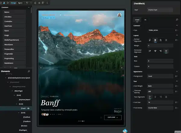
Here is Terra Nova in action. Notice the smooth transitions and the editorial layout style.

Links:
- Source Code: https://github.com/Architrixs/TerraNova_uno
Cross-Platform Magic
This app runs natively on Windows and WebAssembly (Web) from a single shared C# and XAML codebase.
The “Magic” for me was the Layout Engine.
Usually, getting a full-screen image with a gradient overlay to look identical on a Windows Desktop app and a Web Browser requires fighting with CSS or platform-specific hacks. With Uno Platform, I defined my Grid and LinearGradientBrush once in XAML, and it rendered pixel-perfectly on both targets immediately.
Interactive Features
The app is built around a tactile Discovery Flow:
-
The Infinite Carousel: I implemented a full-screen
FlipViewthat allows users to “swipe” through countries like a photo album. - Smart Overlays: A “Vignette” gradient ensures that white text remains readable even when the background photo is bright (like snow in Canada), keeping the interaction accessible.
- Editorial Details: The information (Price, Rating, Title) is laid out with specific letter spacing and weighting to create a “cover story” effect for each location.
The Wow Factor
I am most proud of the Immersive Editorial Flow.
Instead of a busy dashboard, I built a carousel where the destination itself is the UI. By pairing full-bleed imagery with typography-driven layouts found in luxury travel editorials, the app creates a sense of wanderlust that standard grids cannot match. The “Wow” moment comes from the immersive discovery flow—swiping feels less like browsing software and more like turning the pages of a premium travel magazine.
(I also used the Uno Hot Design to tweak the typography weights in real-time to get the editorial look just right!)