React Native Storybook Toggle
🚀 Development Toggle for React Native: Seamless App/Storybook Switching in __DEV__ Mode
Testing UI components in isolation with Storybook is awesome, but context switching can be a pain. Here’s how I implemented a floating toggle button that lets you instantly switch between your main app and Storybook—only in development mode—for maximum developer efficiency.
✨ What’s New?
1. Floating Toggle Button
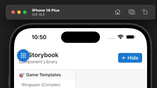
- Position: Top-left, with safe area insets (handles iOS notches/Dynamic Island)
- Design: Blue circular button with outline Ionicons
-
Visibility: Only appears when
__DEV__istrue -
Icons:
-
library-outline(shows when in main app — tap to switch to Storybook) -
apps-outline(shows when in Storybook — tap to switch back)
-
2. Dynamic State Management
-
showStorybookboolean in RootLayout controls which view is active - Tapping the button toggles Storybook/App
- State isn’t persisted (resets on reload)—intentional for dev clarity
3. Safe Area Integration
- Uses
useSafeAreaInsets()for positioning below the notch/Dynamic Island - Works cross-platform (iOS & Android)
🧑💻 Code Changes
app/_layout.tsx
DevToggle Component
function DevToggle({ isStorybook, onToggle }: { isStorybook: boolean; onToggle: () => void }) {
  const insets = useSafeAreaInsets();

  if (!__DEV__) return null;

  return (
    <TouchableOpacity
      onPress={onToggle}
      style={{
        position: 'absolute',
        top: insets.top,
        left: 0,
        zIndex: 1000,
        backgroundColor: '#1976d2',
        borderRadius: 20,
        width: 40,
        height: 40,
        justifyContent: 'center',
        alignItems: 'center',
        shadowColor: '#000',
        shadowOffset: { width: 0, height: 2 },
        shadowOpacity: 0.25,
        shadowRadius: 4,
        elevation: 5,
      }}
    >
      <Ionicons
        name={isStorybook ? "apps-outline" : "library-outline"}
        size={20}
        color="white"
      />
    </TouchableOpacity>
  );
}
RootLayout With Toggle
export default function RootLayout() {
  const [showStorybook, setShowStorybook] = useState(false);

  if (showStorybook && StorybookUIRoot) {
    return (
      <>
        <StorybookUIRoot />
        <DevToggle isStorybook={true} onToggle={() => setShowStorybook(false)} />
      </>
    );
  }

  return (
    <SafeAreaProvider>
      {/* ... main app content ... */}
      <DevToggle isStorybook={false} onToggle={() => setShowStorybook(true)} />
    </SafeAreaProvider>
  );
}
🛠️ Usage Guide
-
Enable Development Mode
- Toggle only appears if
__DEV__istruewhen running Expo with their constants https://docs.expo.dev/versions/latest/sdk/constants.
- Toggle only appears if
-
Switch to Storybook
- Tap the blue
library-outlinebutton in the top-left. - App instantly switches to Storybook UI.
- Tap the blue
-
Switch Back to App
- In Storybook, tap the blue
apps-outlinebutton to return.
- In Storybook, tap the blue
-
Production Safety
- Toggle is auto-hidden in production—no accidental exposure, zero overhead.
🎯 Benefits
Developer Experience
- Instant Access: No code edits or reloads to open Storybook
- Context Jumping: Compare component behavior in isolation vs. app
- Zero Friction: Smooth, fast toggle
Testing Efficiency
- Component Isolation: Use Storybook for focused testing
- Integration: Test in the real app context
- Visual Comparison: Flip back and forth for validation
Team Collaboration
- Easy Design Review: Stakeholders can quickly access component previews
- QA: Testers can validate both isolated and integrated components
- Always-on Docs: Storybook always one tap away
🧩 Technical Details
- Z-Index: 1000 (always on top)
- Safe Area Aware: Respects iOS notches/Dynamic Island
- Shadow: Subtle, for visibility
- Conditional: Only in dev, never in prod
- Touch Target: 40×40 for accessibility
- Contrast: Blue button, white icon
✅ Ready to Switch!
The floating toggle is ready for dev builds and makes testing a breeze.
Questions? Ideas?
Drop a comment! Would love to hear how others handle Storybook/app toggling in React Native.
Happy coding! 🚀


