(Part 7) Build a Simple Chat Character Gallery: Implementing the Chat Page UI
👋 Recap from Previous Post
In the last post, we:
✅ Created a services folder with files for interacting with the API.
✅ Set up React Query in the project by creating areactQuery.tsxfile in the/hooksfolder and wrapping our app withQueryClientProvider.
✅ Integrated hooks intoGalleryPageto fetch all chatbots from the API, replacing the previous mock data (chatbotsData) with live API data.
✅ Implemented basic loading and error states for a better user experience while fetching data.
✅ Created a refresh mechanism so the chatbot list updates automatically after adding a new chatbot.
✅ Added API integration to the Add Chatbot form, allowing us to submit new chatbots, close the modal on success, and see them instantly in the gallery.By the end of the last post, we had a fully functional flow to create and display chatbots directly from the API, replacing the placeholder mock data.
Implementing the Chat Page UI
🎯 Goals for This Post
In this part of the tutorial, we’ll begin implementing the Chat Page UI. The design is straightforward and divided into three main sections: the header, the conversation area, and the input section.
- Header – This will include a placeholder for the chatbot’s avatar, the chatbot’s name, their personality traits, and their hobbies & interests.
- Conversation Area – A simple chat bubble layout, with different colors for messages from the bot and the user. It will also feature a loading chat bubble to indicate when the bot is processing a message.
- Input Section – A minimal input box with a submit button to send messages.
By the end of this tutorial, your app will be able to open the chat page for each chatbot. While chatting won’t work just yet (as we haven’t integrated the API), the UI will be fully set up and ready for the next step.
📱 Step by Step Guide
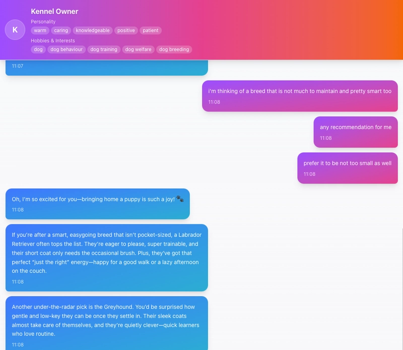
1. Create Header

The first step is to create the header section of the chat page. As shown in the image above, it contains the chatbot’s avatar, name, personality traits, and hobbies. We’ll place this section at the top of the page and make it sticky, so it stays visible when the user scrolls.
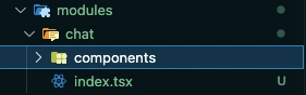
Before we begin coding, let’s set up the folder structure for the Chat module:
- Create a new folder:
/src/modules/chat - Inside it, create another folder named:
/components - Add a file called:
index.tsx
Here’s how it looks
Creating the Chat Header Component
Next, create a file: /src/modules/chat/components/ChatHeader.tsx
This file will contain all the UI code for the header section.
import React from 'react';
import { Chatbot } from '@/types/chatbot';

interface ChatHeaderProps {
  chatbot: Chatbot;
}

const ChatHeader: React.FC<ChatHeaderProps> = ({ chatbot }) => {
  return (
    <header className="border-b p-4 bg-gradient-to-r from-purple-500 via-pink-500 to-orange-500 sticky top-0 z-10 shadow-lg">
      <div className="flex items-center gap-4">
        <div className="h-12 w-12 rounded-full bg-white/20 backdrop-blur-sm flex-shrink-0 ring-2 ring-white/30">
          {chatbot.avatarUrl ? (
            <img
              src={chatbot.avatarUrl}
              alt={chatbot.name}
              className="h-full w-full rounded-full object-cover"
            />
          ) : (
            <div className="flex items-center justify-center h-full w-full text-white text-xl font-bold">
              {chatbot.name.charAt(0)}
            </div>
          )}
        </div>
        <div className="flex-1 min-w-0">
          <h1 className="text-lg font-bold text-white truncate drop-shadow-sm">
            {chatbot.name}
          </h1>
          <div className="space-y-2 mt-1">
            <div className="space-y-1">
              <p className="text-xs text-white/80">Personality</p>
              <div className="flex gap-1 flex-wrap">
                {chatbot.personality.map((trait) => (
                  <span
                    key={trait}
                    className="text-xs px-2 py-0.5 bg-white/20 text-white rounded-full backdrop-blur-sm"
                  >
                    {trait}
                  </span>
                ))}
              </div>
            </div>
            {chatbot.interests && (
              <div className="space-y-1">
                <p className="text-xs text-white/80">Hobbies & Interests</p>
                <div className="flex gap-1 flex-wrap">
                  {chatbot.interests.map((hobby) => (
                    <span
                      key={hobby}
                      className="text-xs px-2 py-0.5 bg-white/20 text-white rounded-full backdrop-blur-sm"
                    >
                      {hobby}
                    </span>
                  ))}
                </div>
              </div>
            )}
          </div>
        </div>
      </div>
    </header>
  );
};

export default ChatHeader;
In the code above:
- All dynamic values (name, avatar, personality, and hobbies) are passed in from outside the component.
- This makes
ChatHeadera stateless component that only handles the presentation. - We added a placeholder avatar if none is provided.
- The hobbies section is only shown if data exists.
Adding the ChatHeader to the Chat Page
Now, let’s add ChatHeader into /chat/index.tsx so you can see your progress. For now, we’ll feed it mock data.
import React from "react";
import ChatHeader from "./components/ChatHeader";

const data = {
  data: {
    id: "1",
    name: "Your Neighbour",
    created_at: new Date().toISOString(),
    updated_at: new Date().toISOString(),
    behaviour: "test",
    tone_style: "test",
  },
};
const personalityArr = ["warm", "caring"];
const interestsArr = ["dog", "yoga", "meditation"];

const ChatPage: React.FC = () => {
  return (
    <div className="flex h-screen flex-col">
      <ChatHeader
        chatbot={{
          id: data?.data.id,
          name: data?.data.name,
          avatarUrl: "",
          createdAt: new Date(data?.data.created_at).toISOString(),
          updatedAt: new Date(data?.data.updated_at).toISOString(),
          personality: personalityArr,
          interests: interestsArr,
          behavior: data?.data.behaviour || "",
          tone_style: data?.data.tone_style || "",
        }}
      />
    </div>
  );
};

export default ChatPage;
Setting Up the Chat Page Route
To make the ChatPage accessible from a URL, create a new file here: /app/chat/[personaId]/[conversationId]/page.tsx
We’re using both personaId and conversationId in the route so that when a user navigates here, we can fetch the correct conversation from the API later.
Here’s the code for /app/chat/[personaId]/[conversationId]/page.tsx
"use client";

import React from "react";
import ChatPage from "@/modules/chat";

const Chat = () => {
  return <ChatPage />;
};

export default Chat;
Connecting the Gallery Page to the Chat Page
Finally, let’s add a click interaction in the GalleryPage so that when a user clicks a chatbot card, they are redirected to the ChatPage (using mock data for now).
// ... rest of the codes

const GalleryPage = () => {
// ----- Add this -----
  const router = useRouter();

// ... rest of the codes

// ----- Update this -----
  const onCardClick = async (id: string) => {
    router.push(`/chat/${id}/testing`);
  };

// ... rest of the codes
}
Here’s what’s happening:
- We import
useRouterfromnext/navigation. - In
GalleryPage, we update the previously emptyonCardClickfunction to userouter.push()and navigate to theChatPage.
At this point, clicking on any chatbot card should take you to the ChatPage. For now, every card will lead to the same mock content.
2. Creating the Conversation Area
After finishing the header section, we’ll move on to building the conversation area. We’ll start with the chat bubble component, which we’ll call MessageBubble.
Create a new file: /src/modules/chat/components/MessageBubble.tsx
import { Card, CardContent } from "@/components/ui/card";
import { cn } from "@/lib/utils";
import { MessageRole } from "@/types/general";
import React, { useMemo } from "react";

interface MessageBubbleProps {
  content: string;
  role: MessageRole;
  timestamp: Date | string;
}

const MessageBubble = ({ content, role, timestamp }: MessageBubbleProps) => {
  const formattedTime = useMemo(() => {
    const date = timestamp instanceof Date ? timestamp : new Date(timestamp);
    return date.toLocaleTimeString([], {
      hour: "2-digit",
      minute: "2-digit",
    });
  }, [timestamp]);

  return (
    <div
      className={`flex ${
        role === "user" ? "justify-end" : "justify-start"
      } animate-fadeIn`}
      aria-live="polite"
      role="log"
    >
      <Card
        className={cn(
          "max-w-xs md:max-w-md lg:max-w-lg shadow-lg transition-all duration-300 hover:shadow-xl",
          role === "user"
            ? "bg-gradient-to-br from-purple-500 to-pink-500 text-white border-0 rounded-2xl rounded-br-sm"
            : "bg-gradient-to-br from-blue-500 to-cyan-500 text-white border-0 rounded-2xl rounded-bl-sm"
        )}
      >
        <CardContent className="p-4">
          <p className="text-sm leading-relaxed">{content}</p>
          <p className="text-xs opacity-80 mt-2">{formattedTime}</p>
        </CardContent>
      </Card>
    </div>
  );
};

export default MessageBubble;
In the code above:
-
MessageBubbleis another stateless component. - We’ve added time formatting to make timestamps shorter and more user-friendly.
- You may notice we’re importing a missing file — we’ll create it now.
Create the following file: /src/types/general.ts
export type MessageRole = 'user' | 'assistant';
Creating a Typing Indicator
Next, let’s create a loading bubble that will appear whenever the chatbot is “typing.”
Create the file: /src/modules/chat/components/TypingIndicator.tsx
import React from 'react';
import { Card, CardContent } from '@/components/ui/card';

const TypingIndicator = ({ isLoading }: { isLoading: boolean }) => {
  if (!isLoading) return null;

  return (
    <div className="px-4 pb-2">
      <Card className="inline-block max-w-xs bg-gradient-to-r from-purple-400 via-pink-400 to-orange-400 border-0 rounded-2xl shadow-lg">
        <CardContent className="p-3">
          <div className="flex items-center gap-2">
            <div
              className="h-3 w-3 rounded-full bg-white animate-bounce"
              style={{ animationDelay: '0ms' }}
            />
            <div
              className="h-3 w-3 rounded-full bg-white animate-bounce"
              style={{ animationDelay: '200ms' }}
            />
            <div
              className="h-3 w-3 rounded-full bg-white animate-bounce"
              style={{ animationDelay: '400ms' }}
            />
          </div>
        </CardContent>
      </Card>
    </div>
  );
};

export default TypingIndicator;
Building the Conversation Area
Now, let’s combine both MessageBubble and TypingIndicator into a single conversation area.
Create the file: /src/modules/chat/components/MessageList.tsx
import React, { useEffect, useRef, useMemo } from "react";
import { MessageRole } from "@/types/general";
import MessageBubble from "./MessageBubble";
import TypingIndicator from "./TypingIndicator";
import { ChatHistory } from "@/types/chat";

interface MessageListProps {
  data: ChatHistory[];
  isLoading?: boolean;
  isShowTyping?: boolean;
  error?: Error | null;
}

const MessageList = ({
  data,
  isLoading,
  isShowTyping,
  error,
}: MessageListProps) => {
  const messagesEndRef = useRef<HTMLDivElement>(null);

  const messages = useMemo(
    () =>
      data.flatMap((e) =>
        e.message.map((content, idx) => ({
          id: `${e.id}-${idx}`,
          content,
          role: e.role as MessageRole,
          timestamp: e.created_at,
        }))
      ),
    [data]
  );

  useEffect(() => {
    messagesEndRef.current?.scrollIntoView({ behavior: "smooth" });
  }, [messages, isShowTyping]);

  return (
    <div
      className="space-y-3 p-4 bg-gradient-to-b from-purple-50/30 via-transparent to-pink-50/30"
      aria-busy={isLoading}
      aria-live="polite"
    >
      {isLoading ? (
        <div className="flex h-64 items-center justify-center">
          <div className="text-center">
            <div className="text-4xl mb-2">⏳</div>
            <p className="text-purple-600 font-medium">Loading messages...</p>
          </div>
        </div>
      ) : error ? (
        <div className="flex h-64 items-center justify-center">
          <div className="text-center">
            <div className="text-4xl mb-2">⚠️</div>
            <p className="text-red-600 font-medium">Error loading messages</p>
            <p className="text-sm text-red-400">{error.message}</p>
          </div>
        </div>
      ) : messages.length === 0 ? (
        <div className="flex h-64 items-center justify-center">
          <div className="text-center">
            <div className="text-4xl mb-2">💬</div>
            <p className="text-purple-600 font-medium">No data yet</p>
            <p className="text-sm text-purple-400">Start the conversation!</p>
          </div>
        </div>
      ) : (
        messages.map((message) => (
          <MessageBubble
            key={message.id}
            content={message.content}
            role={message.role}
            timestamp={message.timestamp}
          />
        ))
      )}
      <TypingIndicator isLoading={isShowTyping || false} />
      <div ref={messagesEndRef} />
    </div>
  );
};

export default MessageList;
In this component:
- We render different states depending on the data: loading, error, no messages, or message list.
- We use
messagesEndRefto automatically scroll to the latest message whenever a new one arrives, whether from the user or the chatbot.
Adding Missing Types & Schemas
You might see another import error due to missing files. Let’s create them now:
1. Create the chat schema file: /src/schema/chat.ts
import z from "zod/v4";
import { timeResponseSchema } from "./general";

const chatSchema = z.object({
  id: z.string(),
  persona_id: z.uuid(),
  created_at: z.date(),
});

export const allChatSchema = z.object({
  conversations: z.array(chatSchema),
});

export const chatMsgSchema = z
  .object({
    id: z.string(),
    conversation_id: z.uuid(),
    role: z.string(),
    message: z.array(z.string()),
  })
  .extend({ ...timeResponseSchema.shape });

export const chatMsgResponseSchema = z.object({
  data: z.array(chatMsgSchema),
});

export const postChatResSchema = z.object({ conversation_id: z.uuid() });

export const postChatMsgReqSchema = z.object({
  query: z.array(z.string()),
});

export const postChatMsgResSchema = z.object({
  response_message: z.array(z.string()),
});
2. Create the chat types file: /src/types/chat.ts
import {
  allChatSchema,
  chatMsgResponseSchema,
  chatMsgSchema,
  postChatMsgReqSchema,
  postChatMsgResSchema,
  postChatResSchema,
} from "@/schema/chat";
import z from "zod/v4";

export type AllChatGetResponse = z.infer<typeof allChatSchema>;
export type ChatMessageGetResponse = z.infer<typeof chatMsgResponseSchema>;
export type PostChatResponse = z.infer<typeof postChatResSchema>;
export type PostChatMessageRequest = z.infer<typeof postChatMsgReqSchema>;
export type PostChatMessageResponse = z.infer<typeof postChatMsgResSchema>;
export type ChatHistory = z.infer<typeof chatMsgSchema>;
At this point, any initial import errors should be resolved. If errors persist, try removing the problematic lines temporarily and re-importing them correctly.
Putting It All Together
Finally, let’s integrate everything into: /src/modules/chat/index.tsx
import React from "react";
import ChatHeader from "./components/ChatHeader";
import MessageList from "./components/MessageList";
import { ChatHistory } from "@/types/chat";

const data = {
  data: {
    id: "1",
    name: "Your Neighbour",
    created_at: new Date().toISOString(),
    updated_at: new Date().toISOString(),
    behaviour: "test",
    tone_style: "test",
  },
};
const personalityArr = ["warm", "caring"];
const interestsArr = ["dog", "yoga", "meditation"];

const updatedMessages: ChatHistory[] = [
  {
    id: "1",
    role: "user",
    message: ["Hello, how are you?"],
    created_at: new Date(),
    updated_at: new Date(),
    conversation_id: "test",
  },
  {
    id: "2",
    role: "assistant",
    message: ["I'm doing well, thank you."],
    created_at: new Date(),
    updated_at: new Date(),
    conversation_id: "test1",
  },
  {
    id: "3",
    role: "user",
    message: ["That's great to hear."],
    created_at: new Date(),
    updated_at: new Date(),
    conversation_id: "test2",
  },
  {
    id: "4",
    role: "assistant",
    message: ["How has your day been so far?"],
    created_at: new Date(),
    updated_at: new Date(),
    conversation_id: "test3",
  },
];

const isMessagesLoading = false;
const messagesError: Error | null = null;
const isPending = false;

const ChatPage: React.FC = () => {
  return (
    <div className="flex h-screen flex-col">
      <ChatHeader
        chatbot={{
          id: data?.data.id,
          name: data?.data.name,
          avatarUrl: "",
          createdAt: new Date(data?.data.created_at).toISOString(),
          updatedAt: new Date(data?.data.updated_at).toISOString(),
          personality: personalityArr,
          interests: interestsArr,
          behavior: data?.data.behaviour || "",
          tone_style: data?.data.tone_style || "",
        }}
      />
      <div className="flex-1 overflow-y-auto">
        <MessageList
          data={updatedMessages}
          isLoading={isMessagesLoading}
          error={messagesError}
          isShowTyping={isPending}
        />
      </div>
    </div>
  );
};

export default ChatPage;
In this step:
- We place the
MessageListcomponent right under the header. - For now, we’re using mock data to populate the conversation.
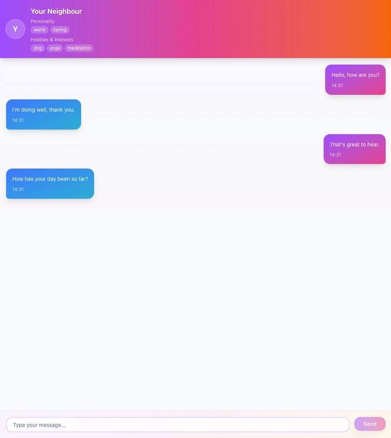
Now, when you open the ChatPage, you should see a simple chat history displayed, complete with user and chatbot messages, plus a typing indicator when the bot is “responding.”
3. Creating the Input Section for the Chat
The next step is to create the input box for our chat.
This section will consist of:
- A text input field
- A send button
- A character limit to prevent overly long messages
If the user exceeds the character limit, we’ll display a red warning message and prevent the message from being submitted.
Create the Input Component
Create the file: /src/modules/chat/components/MessageInput.tsx
"use client";

import React, { useState } from "react";
import { Button } from "@/components/ui/button";
import Input from "@/components/ui/input";

interface MessageInputProps {
  messages: string;
  onSubmit: (e: React.FormEvent) => void;
  onChange: (e: React.ChangeEvent<HTMLInputElement>) => void;
  isSubmitting?: boolean;
}

const MAX_MESSAGE_LENGTH = 500;

const MessageInput = ({
  messages,
  onSubmit,
  onChange,
  isSubmitting = false,
}: MessageInputProps) => {
  const [isOverLimit, setIsOverLimit] = useState(false);

  const handleChange = (e: React.ChangeEvent<HTMLInputElement>) => {
    const value = e.target.value;
    setIsOverLimit(value.length > MAX_MESSAGE_LENGTH);
    onChange(e);
  };

  const handleSubmit = (e: React.FormEvent) => {
    e.preventDefault();
    if (!messages.trim() || isOverLimit) return;
    onSubmit(e);
  };

  return (
    <form
      onSubmit={handleSubmit}
      className="flex gap-3 p-4 bg-gradient-to-r from-purple-50 via-pink-50 to-orange-50 border-t border-purple-100"
      aria-label="Message input form"
    >
      <div className="flex-1 relative">
        <Input
          value={messages}
          onChange={handleChange}
          placeholder="Type your message..."
          className={`w-full border-2 ${
            isOverLimit ? "border-red-300" : "border-purple-200"
          } focus:border-purple-400 focus:ring-2 focus:ring-purple-200 rounded-xl px-4 py-2 transition-all duration-200 bg-white/80 backdrop-blur-sm`}
          aria-label="Message input"
          aria-invalid={isOverLimit}
          maxLength={MAX_MESSAGE_LENGTH}
        />
        {isOverLimit && (
          <span className="absolute bottom-full mb-1 text-xs text-red-500">
            Message too long (max {MAX_MESSAGE_LENGTH} characters)
          </span>
        )}
      </div>
      <Button
        type="submit"
        disabled={!messages.trim() || isOverLimit || isSubmitting}
        className="bg-gradient-to-r from-purple-500 to-pink-500 hover:from-purple-600 hover:to-pink-600 text-white font-semibold rounded-xl px-6 py-2 transition-all duration-200 transform hover:scale-105 disabled:opacity-50 disabled:cursor-not-allowed shadow-lg hover:shadow-xl"
        aria-busy={isSubmitting}
      >
        {isSubmitting ? (
          <span className="flex items-center gap-2">
            <span className="inline-block w-4 h-4 border-2 border-white border-t-transparent rounded-full animate-spin"></span>
            Sending...
          </span>
        ) : (
          "Send"
        )}
      </Button>
    </form>
  );
};

export default MessageInput;
Add the Input to the Chat Page
Once the MessageInput component is ready, let’s import it into our ChatPage component and place it at the very bottom of the layout.
const ChatPage: React.FC = () => {
  // ----- Add these -----
  const [curInput, setCurInput] = useState<string>("");

  const onInputChange = (e: React.ChangeEvent<HTMLInputElement>) => {
    const value = e.target.value;
    setCurInput(value);
  };

  const handleSubmit = (e: React.FormEvent) => {
    e.preventDefault();

    setCurInput("");
  };
  // ----- END -----

  return (
    <div className="flex h-screen flex-col">
      <ChatHeader
        chatbot={{
          id: data?.data.id,
          name: data?.data.name,
          avatarUrl: "",
          createdAt: new Date(data?.data.created_at).toISOString(),
          updatedAt: new Date(data?.data.updated_at).toISOString(),
          personality: personalityArr,
          interests: interestsArr,
          behavior: data?.data.behaviour || "",
          tone_style: data?.data.tone_style || "",
        }}
      />
      <div className="flex-1 overflow-y-auto">
        <MessageList
          data={updatedMessages}
          isLoading={isMessagesLoading}
          error={messagesError}
          isShowTyping={isPending}
        />
      </div>
      {/** Add These */}
      <MessageInput
        messages={curInput}
        onChange={onInputChange}
        onSubmit={handleSubmit}
      />
    </div>
  );
};
In the updated ChatPage:
- We export
MessageInputand place it directly belowMessageList. - We introduce a new piece of state:
const [curInput, setCurInput] = useState("");
- We add two new functions:
- onInputChange → handles the onChange event from MessageInput and updates the state.
- handleSubmit → handles the onSubmit event from MessageInput.
At this point, your Chat Page should:
✅ Display a static header
✅ Show a message list populated with mock data
✅ Contain a chat input box with character limit validation
The input box won’t actually send messages to the conversation yet — we’ll implement that in the next part when we integrate with the API.
🚀 What’s Next?
In the next post, we’ll connect our chat interface to the chatbot API, allowing you to have real conversations with each bot you’ve created and finally see all your hard work come to life.
New posts will be released every 2–3 days, so make sure to subscribe or bookmark this page to stay updated!
Please check Part 8 here:
👉 (Part 8) Build a Simple Chat Character Gallery: Integrating Chat API