(Part 3) Build a Simple Chat Character Gallery: Creating Card Component
👋 Recap from Previous Post
In the last post, we set up the project, installed the necessary tools to get started, and update some of the configs file. Now, let’s move on to building one of the core UI elements: the Character Card Component, which will be used to display each AI character in the gallery.
Creating Card Component
🎯 Goals for This Post
In this part of the tutorial, our goals are to:
- Create a reusable Character Card component to display each AI chatbot.
- Make the component responsive, so it looks good on all screen sizes.
- Build a layout that can render multiple Character Cards in a flexible grid.
By the end, you’ll have a responsive grid of character cards and ready to be filled with any AI persona you want!
📱 Step by Step Guide
1. Create New Folders for Gallery Page
Let’s start by creating a folder to organize the code for our Gallery Page. This will be placed at: src/modules/gallery/index.tsx.
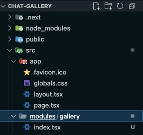
Why use a modules folder? The modules directory will serve as the central place for all your app’s main features or pages. This helps keep the codebase modular and easier to maintain as the project grows.
Next, let’s create a reusable component for displaying each character card. We’ll place this component in the following path:
src/modules/gallery/components/ChatbotCard.tsx
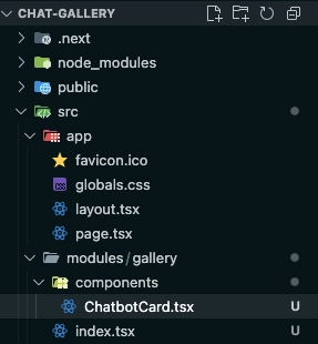
We’re also creating a new components folder inside the gallery module. This folder will serve as the home for all reusable UI components specific to the Gallery Page. Keeping components organized like this helps maintain a clean and modular project structure as the app grows.
2. Creating ChatbotCard
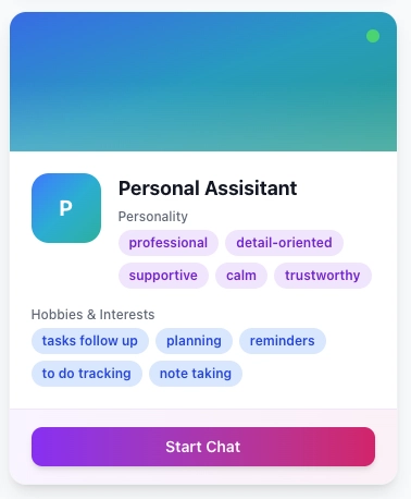
In this step, our goal is to build the main ChatbotCard component, the card UI you saw earlier in the gallery layout and shown above. This component will display a chatbot’s avatar, name, personality, interests, and a start chat button.
To begin, I’ll show you the full code for ChatbotCard.tsx, and then we’ll break down and create the smaller components and utilities used inside it.
Here’s the full code for ChatbotCard.tsx:
import React from 'react';
import { Chatbot } from '@/types/chatbot';
import { Card, CardContent, CardFooter } from '@/components/ui/card';
import { Button } from '@/components/ui/button';
import { cn } from '@/lib/utils';

const gradientColors = [
  'from-purple-500 via-pink-500 to-red-500',
  'from-blue-500 via-cyan-500 to-teal-500',
  'from-green-500 via-emerald-500 to-teal-500',
  'from-orange-500 via-amber-500 to-yellow-500',
  'from-indigo-500 via-purple-500 to-pink-500',
];

interface ChatbotCardProps {
  chatbot: Chatbot;
  onClick: (id: string) => void;
}

export function ChatbotCard({ chatbot, onClick }: ChatbotCardProps) {
  const randomGradient =
    gradientColors[chatbot.id.charCodeAt(0) % gradientColors.length];

  const handleClick = () => {
    onClick(chatbot.id);
  };

  return (
    <Card
      className={cn(
        'bg-white rounded-2xl shadow-lg overflow-hidden',
        'transition-all duration-300 hover:shadow-xl hover:-translate-y-1',
        'border border-gray-100',
        'cursor-pointer group flex flex-col h-full'
      )}
      onClick={handleClick}
      aria-label={`Chatbot: ${chatbot.name}`}
      tabIndex={0}
      onKeyDown={(e) => {
        if (e.key === 'Enter' || e.key === ' ') {
          e.preventDefault();
          handleClick();
        }
      }}
    >
      <div
        className={`h-32 bg-gradient-to-br ${randomGradient} relative overflow-hidden`}
      >
        <div className="absolute inset-0 bg-black/10" />
        <div className="absolute bottom-0 left-0 right-0 h-16 bg-gradient-to-t from-white/20 to-transparent" />
        <div className="absolute top-4 right-4">
          <div className="w-3 h-3 bg-green-400 rounded-full animate-pulse" />
        </div>
      </div>

      <div className="grow flex flex-col justify-between">
        <CardContent className="p-5">
          <div className="flex items-start gap-4 mb-4">
            <div
              className={cn(
                'w-16 h-16 rounded-xl bg-gradient-to-br flex-shrink-0',
                randomGradient,
                'flex items-center justify-center text-white font-bold text-xl'
              )}
            >
              {chatbot.name.charAt(0).toUpperCase()}
            </div>
            <div className="flex-1">
              <h3 className="font-bold text-lg text-gray-900 mb-1 group-hover:text-purple-600 transition-colors">
                {chatbot.name}
              </h3>
              <div className="space-y-1">
                <p className="text-xs font-medium text-gray-500">Personality</p>
                <div className="flex flex-wrap gap-1.5">
                  {chatbot.personality.map((trait) => (
                    <span
                      key={trait}
                      className="px-2.5 py-1 text-xs font-semibold text-purple-700 bg-purple-100 rounded-full"
                    >
                      {trait}
                    </span>
                  ))}
                </div>
              </div>
            </div>
          </div>

          <div className="space-y-2">
            {chatbot.interests && (
              <div className="space-y-1">
                <p className="text-xs font-medium text-gray-500">
                  Hobbies & Interests
                </p>
                <div className="flex flex-wrap gap-1.5">
                  {chatbot.interests.map((el) => (
                    <span
                      key={el}
                      className="px-2.5 py-1 text-xs font-semibold text-blue-700 bg-blue-100 rounded-full"
                    >
                      {el}
                    </span>
                  ))}
                </div>
              </div>
            )}
          </div>
        </CardContent>

        <CardFooter className="px-5 py-4 bg-gradient-to-r from-purple-50 to-pink-50 border-t border-purple-100">
          <Button
            className={cn(
              'w-full bg-gradient-to-r from-purple-600 to-pink-600',
              'hover:from-purple-700 hover:to-pink-700',
              'text-white font-semibold',
              'transition-all duration-200 hover:scale-105',
              'shadow-md hover:shadow-lg cursor-pointer'
            )}
            onClick={(e) => {
              e.stopPropagation();
              handleClick();
            }}
            aria-label={`Start chat with ${chatbot.name}`}
          >
            Start Chat
          </Button>
        </CardFooter>
      </div>
    </Card>
  );
}
This file introduces a few building blocks and utilities:
-
cn– A utility function to help conditionally combine Tailwind class names. -
CardContent,CardFooter,Card,Button– Reusable UI components that help keep the layout clean and consistent. -
Chatbot– A TypeScript type to describe the structure of our chatbot data.
We’ll go over each of these next, so don’t worry if they’re unfamiliar.
Creating the cn Utility Function
Before we dive into building the components, let’s start by setting up a utility function called cn. This function will help us manage and combine Tailwind className strings more effectively.
We’ll place this utility in a file located at @/lib/utils.ts (or src/lib/utils.ts, depending on your project setup). The utils.ts file will serve as a central place to store any general-purpose helper functions you create throughout the project.
Here’s the code for the cn function:
import { ClassValue, clsx } from 'clsx';
import { twMerge } from 'tailwind-merge';

export const cn = (...inputs: ClassValue[]) => {
  return twMerge(clsx(inputs));
};
Creating CardContent, CardFooter, Card, and Button components
Next, we’ll build a set of reusable UI components that will be shared throughout the project. To keep things organized, we’ll place these components inside the src/components/ui/ directory, grouped into two files: button.tsx and card.tsx.
These components will help us maintain consistent design and structure across the app.
Button Component
Here’s the code for Button:
import React, { ComponentProps } from 'react';
import { cva, type VariantProps } from 'class-variance-authority';

import { cn } from '@/lib/utils';

const buttonVariants = cva(
  "inline-flex items-center justify-center gap-2 whitespace-nowrap rounded-md text-sm font-medium transition-all disabled:pointer-events-none disabled:opacity-50 [&_svg]:pointer-events-none [&_svg:not([class*='size-'])]:size-4 shrink-0 [&_svg]:shrink-0 outline-none focus-visible:border-ring focus-visible:ring-ring/50 focus-visible:ring-[3px] aria-invalid:ring-destructive/20 dark:aria-invalid:ring-destructive/40 aria-invalid:border-destructive",
  {
    variants: {
      variant: {
        default:
          'bg-primary text-primary-foreground shadow-xs hover:bg-primary/90',
        destructive:
          'bg-destructive text-white shadow-xs hover:bg-destructive/90 focus-visible:ring-destructive/20 dark:focus-visible:ring-destructive/40 dark:bg-destructive/60',
        outline:
          'border bg-background shadow-xs hover:bg-accent hover:text-accent-foreground dark:bg-input/30 dark:border-input dark:hover:bg-input/50',
        secondary:
          'bg-secondary text-secondary-foreground shadow-xs hover:bg-secondary/80',
        ghost:
          'hover:bg-accent hover:text-accent-foreground dark:hover:bg-accent/50',
        link: 'text-primary underline-offset-4 hover:underline',
      },
      size: {
        default: 'h-9 px-4 py-2 has-[>svg]:px-3',
        sm: 'h-8 rounded-md gap-1.5 px-3 has-[>svg]:px-2.5',
        lg: 'h-10 rounded-md px-6 has-[>svg]:px-4',
        icon: 'size-9',
      },
    },
    defaultVariants: {
      variant: 'default',
      size: 'default',
    },
  }
);

const Button = ({
  className,
  variant,
  size,
  ...props
}: ComponentProps<'button'> &
  VariantProps<typeof buttonVariants>) => {
  return (
    <button
      data-slot="button"
      className={cn(buttonVariants({ variant, size, className }))}
      {...props}
    />
  );
};

export { Button };
By this time, there should be some errors in importing from some of these files. For those that needs to be installed please add them.
pnpm add class-variance-authority
Card, CardContent, and CardFooter Components
Here’s the code for CardContent, CardFooter, and Card in card.tsx:
import React, { HTMLAttributes } from 'react';

import { cn } from '@/lib/utils';

const Card = ({ className, ...props }: HTMLAttributes<HTMLDivElement>) => (
  <div
    className={cn(
      'rounded-xl border bg-card text-card-foreground shadow',
      className
    )}
    {...props}
  />
);

const CardContent = ({
  className,
  ...props
}: HTMLAttributes<HTMLDivElement>) => (
  <div className={cn('p-6 pt-0', className)} {...props} />
);

const CardFooter = ({
  className,
  ...props
}: HTMLAttributes<HTMLDivElement>) => (
  <div className={cn('flex items-center p-6 pt-0', className)} {...props} />
);

export { Card, CardFooter, CardContent };
Defining the Chatbot Type
Now let’s define the Chatbot type, which will be used as part of the ChatbotCardProps to define the expected structure of a chatbot object.
To keep things clean and maintainable, we’ll create a dedicated folder for all our types. Place this file in src/types/chatbot.ts.
Here’s the code for the Chatbot type:
interface Persona {
  behavior: string;
  personality: string[];
  interests: string[];
  tone_style: string;
}

export interface Chatbot extends Persona {
  id: string;
  name: string;
  avatarUrl?: string;
  createdAt: string;
  updatedAt: string;
}
The reason why we separate the types into Persona and Chatbot to keep our codebase modular and maintainable. By isolating the Persona type, we make it reusable across other parts of the project where only persona related data is needed. It’s generally a good practice to split types when it makes logical sense. This helps with scalability, clarity, and type safety in larger projects.
Now that we have created the ChatbotCard component, it’s time for us to add them to the Gallery Page and group them all together.
3. Updating Gallery Page with ChatbotCard
Now that we’ve created the ChatbotCard component, it’s time to integrate it into the GalleryPage. In this step, we’ll render a collection of chatbot cards, each representing a unique AI character.
The goal is to display multiple ChatbotCard components in a responsive layout that feels clean and easy to browse.
When populating the characters, feel free to adjust and add their personality traits or interests. Just remember: each trait should be separated by a comma for it to work correctly.
"use client";

import React from "react";
import { ChatbotCard } from "./components/ChatbotCard";

const filteredChatbots = [
  {
    id: "1",
    name: "Chatbot 1",
    avatarUrl: "",
    behaviour: "Chatbot 1 behaviour",
    personality: "professional, detail-oriented, calm",
    interests: "planning, data organization, note taking",
    tone_style: "formal, friendly",
    created_at: new Date().getTime(),
    updated_at: new Date().getTime(),
  },
  {
    id: "2",
    name: "Chatbot 2",
    avatarUrl: "",
    behaviour: "Chatbot 2 behaviour",
    personality: "playful, witty, chill",
    interests: "astrology, indie music, coffee",
    tone_style: "casual, friendly, flirty sometimes",
    created_at: new Date().getTime(),
    updated_at: new Date().getTime(),
  },
  {
    id: "3",
    name: "Chatbot 3",
    avatarUrl: "",
    behaviour: "Chatbot 3 behaviour",
    personality: "playful, teasing, proud",
    interests: "Sweets, Desserts, Fashion",
    tone_style: "casual with friends, cold with others",
    created_at: new Date().getTime(),
    updated_at: new Date().getTime(),
  },
];

const GalleryPage = () => {
  const onCardClick = () => {
    // Do nothing yet
  };

  return (
    <div className="container mx-auto px-4 py-8">
      <div className="mb-8">
        <h1 className="text-3xl font-bold text-gray-900">Chatbot Gallery</h1>
      </div>

      <div className="grid grid-cols-1 md:grid-cols-4 gap-6">
        <div className="md:col-span-3">
          <div
            className="grid grid-cols-1 md:grid-cols-2 lg:grid-cols-3 gap-6"
            role="region"
            aria-label="Chatbot list"
            aria-live="polite"
          >
            {filteredChatbots.map((persona) => {
              const interests = persona.interests
                ? persona.interests.split(",").map((i) => i.trim())
                : [];
              const personality = persona.personality
                ? persona.personality.split(",").map((p) => p.trim())
                : [];

              return (
                <div key={persona.id}>
                  <ChatbotCard
                    chatbot={{
                      id: persona.id,
                      name: persona.name,
                      avatarUrl: "",
                      behavior: persona.behaviour || "",
                      personality: personality,
                      interests: interests,
                      tone_style: persona.tone_style || "",
                      createdAt:
                        new Date(persona.created_at).toISOString() ||
                        new Date().toISOString(),
                      updatedAt:
                        new Date(persona.updated_at).toISOString() ||
                        new Date().toISOString(),
                    }}
                    onClick={onCardClick}
                  />
                </div>
              );
            })}

            {filteredChatbots.length === 0 && (
              <div className="col-span-full text-center py-12">
                <p className="text-sm text-gray-500">
                  No chatbots match your search criteria
                </p>
              </div>
            )}
          </div>
        </div>
      </div>
    </div>
  );
};

export default GalleryPage;
To wrap up today’s post, let’s update app/page.tsx to ensure users are directed to the GalleryPage by default when they visit the root URL of the app.
Here’s the code for app/page.tsx:
import React from "react";
import GalleryPage from "@/modules/gallery";

export default function Home() {
  return <GalleryPage />;
}
Now it’s time to see everything in action! You can run your app locally with the following command:
pnpm dev
Once it’s up and running, open your browser and navigate to:
http://localhost:3000
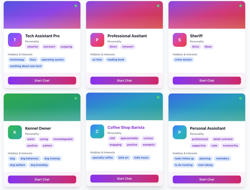
You should see a page that looks like this:
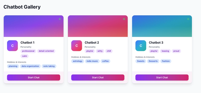
That’s it for today!
In this post, you’ve built the foundation of the Chat Character Gallery by setting up reusable UI components and displaying multiple chatbot cards on the Gallery page. You now have a clean and responsive layout that’s ready to be expanded with real data and interactivity.
🚀 What’s Next?
In the next post, we’ll start connecting the chatbots with dynamic content. You’ll learn how to manage character data, store it, and eventually enable user-generated bots.
New posts will be released every 2–3 days, so make sure to subscribe or bookmark this page to stay updated!
Please check Part 4 here:
👉 (Part 4) Build a Simple Chat Character Gallery: Adding Searchbar & Filter