Looking for the Best React Data Grid (Table)? It’s Probably on This List
Displaying large sets of data is a common requirement in many web applications. While a simple HTML <table> might suffice for a few rows, managing features like editing, sorting, filtering, pagination, and virtualization for thousands or even millions of records can become incredibly complex. Building a feature-rich and performant data grid from scratch is a significant undertaking.
This is where data grid (or data table) libraries come in. They provide robust, pre-built solutions that handle the heavy lifting, allowing you to focus on your application’s core logic. In this post, we’ll explore five of the best (IMO) React data grid libraries. We’ll look at their syntax, key features, and performance to help you choose the best fit for your next project.
The lists are ordered randomly, and any of these libraries is a good choice if it fits your needs.
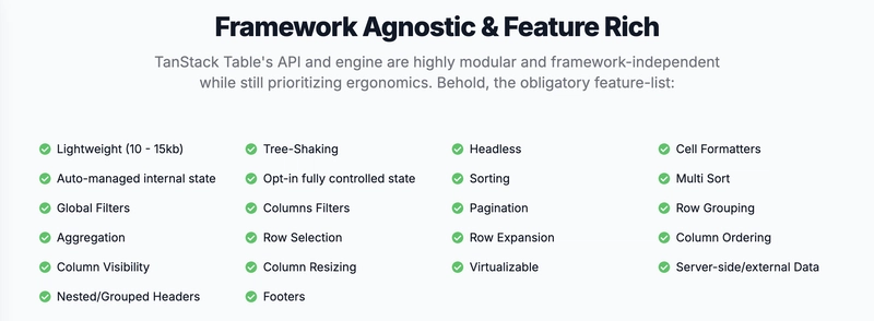
TanStack Table
Formerly known as React Table, TanStack Table is a headless UI library for building powerful tables and data grids. Being “headless” means it doesn’t render any markup or styles for you. Instead, it provides the logic, state, and API hooks to build your own custom table structure. This gives you complete control over the look and feel, making it incredibly flexible.
It’s framework-agnostic, lightweight, and built with TypeScript for excellent type safety.
The following example demonstrates how to set up a basic table using TanStack Table:
import {
  createColumnHelper,
  flexRender,
  getCoreRowModel,
  useReactTable,
} from "@tanstack/react-table";

const defaultData = [
  {
    firstName: "tanner",
    lastName: "linsley",
    age: 33,
    visits: 100,
    progress: 50,
  },
  {
    firstName: "derek",
    lastName: "perkins",
    age: 40,
    visits: 40,
    progress: 80,
  },
  { firstName: "joe", lastName: "dirksen", age: 45, visits: 20, progress: 40 },
];

const columnHelper = createColumnHelper();

const columns = [
  columnHelper.accessor("firstName", { header: "First Name" }),
  columnHelper.accessor("lastName", { header: "Last Name" }),
  columnHelper.accessor("age", { header: "Age" }),
  columnHelper.accessor("visits", { header: "Visits" }),
  columnHelper.accessor("progress", { header: "Profile Progress" }),
];

function App() {
  const table = useReactTable({
    data: defaultData,
    columns,
    getCoreRowModel: getCoreRowModel(),
  });

  return (
    <table>
      <thead>
        {table.getHeaderGroups().map((headerGroup) => (
          <tr key={headerGroup.id}>
            {headerGroup.headers.map((header) => (
              <th key={header.id}>
                {flexRender(
                  header.column.columnDef.header,
                  header.getContext(),
                )}
              </th>
            ))}
          </tr>
        ))}
      </thead>
      <tbody>
        {table.getRowModel().rows.map((row) => (
          <tr key={row.id}>
            {row.getVisibleCells().map((cell) => (
              <td key={cell.id}>
                {flexRender(cell.column.columnDef.cell, cell.getContext())}
              </td>
            ))}
          </tr>
        ))}
      </tbody>
    </table>
  );
}
The core of TanStack Table is the useReactTable hook, which takes your data and columns and returns a table instance. This instance contains everything you need to render your table, from header groups to row models. The flexRender utility is used to render the content for headers and cells, which makes it easy to define them as strings or JSX components. Because you control the rendering, you can use any styling solution you prefer, from CSS modules to styled-components. Check out the same code but with Tailwind CSS.
MUI X Data Grid
For developers already working within the MUI (formerly Material-UI) ecosystem, the MUI X Data Grid is a natural choice. It offers a seamless integration with MUI’s design system and components. It comes in three versions:
- Open-source version: The Community version is a sophisticated implementation of the Material UI Table, offering features such as editing, sorting, filtering, and pagination.
- Pro version: The Pro plan expands on the Community version to support more complex use cases, with features like advanced filtering, column pinning, column and row reordering, support for tree data, and virtualization to handle larger datasets.
- Premium version: The Premium plan includes all Pro features as well as more advanced features for data analysis and large dataset management, such as row grouping with aggregation functions (like sum and average) and the ability to export to Excel files.
Here’s an example of how to use the MUI X Data Grid in a React project:
import { DataGrid } from "@mui/x-data-grid";

const columns = [
  { field: "id", headerName: "ID", width: 70 },
  { field: "firstName", headerName: "First name", width: 130 },
  { field: "lastName", headerName: "Last name", width: 130 },
  { field: "age", headerName: "Age", type: "number", width: 90 },
];

const rows = [
  { id: 1, lastName: "Snow", firstName: "Jon", age: 35 },
  { id: 2, lastName: "Lannister", firstName: "Cersei", age: 42 },
  { id: 3, lastName: "Lannister", firstName: "Jaime", age: 45 },
  { id: 4, lastName: "Stark", firstName: "Arya", age: 16 },
  { id: 5, lastName: "Targaryen", firstName: "Daenerys", age: null },
];

export default function DataTable() {
  return (
    <div style={{ height: 400, width: "100%" }}>
      <DataGrid
        rows={rows}
        columns={columns}
        initialState={{
          pagination: {
            paginationModel: { page: 0, pageSize: 5 },
          },
        }}
        pageSizeOptions={[5, 10]}
        checkboxSelection
      />
    </div>
  );
}
As you can see, the API is straightforward. You define your columns and rows and pass them to the <DataGrid /> component. It handles the rest. The grid is highly configurable through props, allowing you to customize its behavior and appearance while adhering to Material Design principles. The commercial plans unlock more advanced features like column pinning, tree data, and master-detail views. You can play around with a sample here.
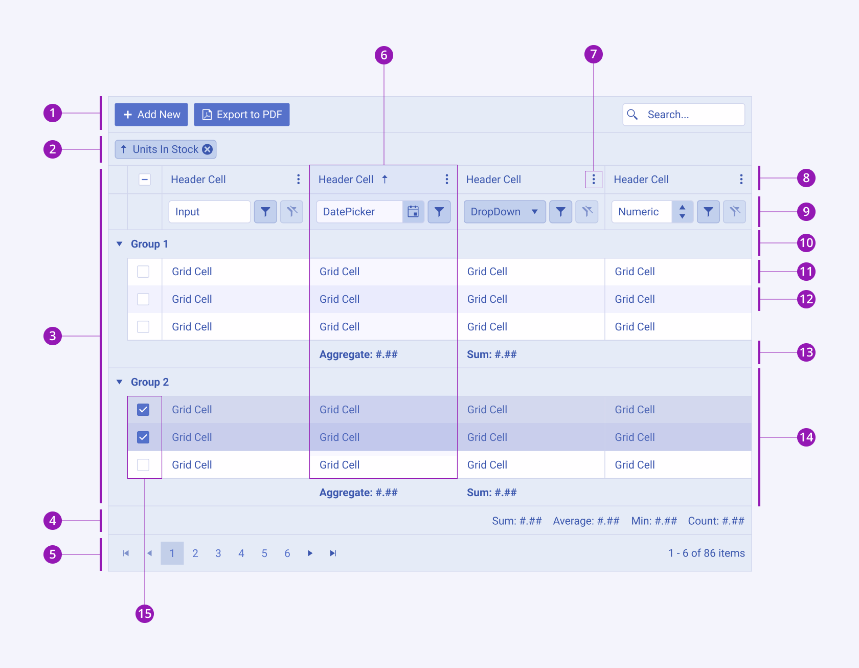
KendoReact Data Grid
The KendoReact Data Grid is a professional, enterprise-grade grid component built natively for React. It’s part of the extensive Progress KendoReact UI library and is designed for building complex, data-heavy business applications.
While KendoReact is a commercial library, it offers a generous free tier called KendoReact Free. The free version of the Data Grid includes essential features like column resizing and reordering, row filtering, single-column sorting, and CSV export. Premium features like multi-column sorting, advanced filtering, grouping, virtualization, and PDF/Excel export require a license. This makes it accessible for smaller projects while providing a clear upgrade path for enterprise needs.
Here’s a simple example of how to use the KendoReact Data Grid:
import { Grid, GridColumn } from "@progress/kendo-react-grid";
import products from "./products.json";

const App = () => {
  return (
    <Grid data={products}>
      <GridColumn field="ProductName" title="Product Name" width="250px" />
      <GridColumn field="UnitPrice" title="Unit Price" />
      <GridColumn field="UnitsInStock" title="Units In Stock" />
      <GridColumn
        field="Discontinued"
        cell={(props) => (
          <td>
            <input
              type="checkbox"
              disabled
              checked={props.dataItem[props.field]}
            />
          </td>
        )}
      />
    </Grid>
  );
};
export default App;
The KendoReact Grid is defined using the <Grid /> component, with <GridColumn /> components for each column. It’s packed with features and is built for performance, leveraging techniques like row and column virtualization to handle massive datasets smoothly. It also offers robust support for data editing, custom cell rendering, and has first-class support for React Server Components (RSC), which can significantly improve performance by offloading data operations to the server.
You can play around with a live demo on Stackblitz.
AG Grid
AG Grid markets itself as “the best JavaScript Data Grid in the world,” and it has a strong claim to that title. It’s an extremely powerful and feature-rich grid that is popular for enterprise-level applications requiring high performance and a vast feature set.
AG Grid comes in two forms: AG Grid Community, which is free and open-source, and AG Grid Enterprise, which is a commercial product that includes more advanced features like pivoting, aggregation, and integrated charting.
Here’s a simple example of how to use AG Grid:
import { useState } from "react";
import { AgGridReact } from "ag-grid-react";

import "ag-grid-community/styles/ag-grid.css";
import "ag-grid-community/styles/ag-theme-alpine.css";

const App = () => {
  const [rowData] = useState([
    { make: "Toyota", model: "Celica", price: 35000 },
    { make: "Ford", model: "Mondeo", price: 32000 },
    { make: "Porsche", model: "Boxster", price: 72000 },
  ]);

  const [columnDefs] = useState([
    { field: "make" },
    { field: "model" },
    { field: "price" },
  ]);

  return (
    <div className="ag-theme-alpine" style={{ height: 400, width: 600 }}>
      <AgGridReact rowData={rowData} columnDefs={columnDefs}></AgGridReact>
    </div>
  );
};
The primary component is <AgGridReact />. You provide rowData and columnDefs to populate the grid. AG Grid’s strength lies in its performance and the sheer number of features it offers. It’s designed to handle real-time data updates and large volumes of data with ease. The learning curve can be steeper than other libraries due to its extensive API, but for complex scenarios, it’s often the best tool for the job.
You can play around with a sample React data grid on CodeSandbox.
react-data-grid
react-data-grid is a powerful, open-source data grid that feels like an Excel spreadsheet. It’s highly customizable and performant, offering features like cell editing, row selection, column resizing, and multi-column sorting.
It’s a component-based grid where you have control over rendering, but it comes with sensible defaults. To get the default styling, you need to import its CSS file. Here’s a simple example copied from their documentation:
import DataGrid from "react-data-grid";
import "react-data-grid/lib/styles.css";

const columns = [
  { key: "id", name: "ID" },
  { key: "title", name: "Title" },
  { key: "count", name: "Count" },
];

const rows = [
  { id: 0, title: "row1", count: 20 },
  { id: 1, title: "row1", count: 40 },
  { id: 2, title: "row1", count: 60 },
];

function App() {
  return <DataGrid columns={columns} rows={rows} />;
}
The API is simple and declarative. You pass columns and rows arrays to the <DataGrid /> component. It is a solid choice if you need a feature-rich, spreadsheet-like experience without the cost of a commercial license. It provides a good balance between ease of use and customization.
Performance Benchmark
Performance is a critical factor when choosing a data grid, especially for applications handling large datasets. I ran some internal benchmarks on a private project to compare KendoReact, AG Grid, and MUI X. The results measure the time for the grid to render in milliseconds (ms).
Note: These benchmarks were run on a specific machine and project. Your results may vary.
Basic Grid Tests (No Virtualization)
| Test Case | KendoReact (11.0.0) | AG Grid (33.0.4) | MUI X (8.5.1) |
|---|---|---|---|
| 100 rows, 10 cols | 151ms | 211ms | 151ms |
| 1000 rows, 10 cols | 723ms | 864ms | 583ms |
| 5000 rows, 20 cols | 5266ms | 6890ms | 4174ms |
Virtual Row Grid Tests
| Test Case | KendoReact (11.0.0) | AG Grid (33.0.4) | MUI X (8.5.1) |
|---|---|---|---|
| 10,000 rows, 10 cols | 84ms | 157ms | 120ms |
| 100,000 rows, 10 cols | 89ms | 158ms | 222ms |
| 1,000,000 rows, 10 cols | 218ms | 549ms | 1832ms |
Row & Column Virtual Grid Tests
| Test Case | KendoReact (11.0.0) | AG Grid (33.0.4) | MUI X (8.5.1) |
|---|---|---|---|
| 10,000 rows, 100 cols | 181ms | 144ms | 126ms |
| 100,000 rows, 100 cols | 189ms | 171ms | 247ms |
These numbers show that all three are highly performant, but KendoReact shows particularly strong performance with extremely large datasets in virtualized mode.
Conclusion
Choosing the right React data grid library depends heavily on your project’s specific needs, the budget, and your team’s familiarity with certain ecosystems.
- TanStack Table is the perfect choice if you need a lightweight, unopinionated, and fully customizable solution. It gives you the power and leaves the presentation up to you.
- KendoReact Data Grid is a performance powerhouse for the most demanding, complex data scenarios just like you saw in the benchmarks. It’s a top choice for enterprise applications that need every feature imaginable, top-notch speed, and professional support. The free tier makes it great to start with, and upgrade when necessary.
- MUI X Data Grid is a no-brainer if you’re already using MUI. It provides a beautiful, consistent UI with a great developer experience.
- AG Grid is a strong contender to KendoReact and MUI X for a comprehensive feature set in data-intensive applications.
- react-data-grid offers a great balance of features, customization, and ease of use for an open-source library, especially if you’re looking for a spreadsheet-like feel.
Like I said, any of these libraries is a good choice if it fits your needs. Evaluate your feature requirements, performance needs, and budget, and you’ll find the perfect grid for your application.