Graphing in JavaScript
I feel incomplete without a graphing utility.
It probably has something to do with majoring in physics. Visualizing relationships in space – “thinking in graphs” – is a natural way for me to explore a problem or communicate an idea. In Python, things were easy. Matplotlib was more or less the standard graphing library, and was more than sufficient for my purposes. Now that I’m getting a handle on JavaScript, one of my first priorities is to find a native way to accomplish the same thing.
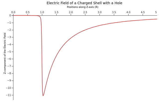
Let’s try recreating a matplotlib graph from an old class project. The premise was to calculate the electric field of a not-quite-spherically symmetric shell of charge, both analytically and computationally, and then compare the results. I’ve slightly edited the code for brevity and clarity, but you can see my original project here. (One day I’d like to go back and reimplement this – I can think of several things I could improve. At the time, however, I was very proud of my code for matching the analytical solution so well.)
Here’s the (edited) Python script:
import matplotlib.pyplot as plt
import numpy as np
import numpy.ma as M
import math

#Initiate plot
fig = plt.figure()

#Create a list of z values
z = np.linspace(0,5,501)

#Opens a text file containing the output of ElectricField.py, reformatted to have only the z-values
#I could have appended all the graphing stuff to the end of the other program, but that would require recalculating the field every
#time I wanted to regraph
f = open("sample.txt", 'r');
zOutput = []

#Collect calculated field values into a list
for i in f:
    zOutput.append(float(i))

f.close()

R = 1
PI = math.pi
degCos = math.cos(PI/180)

#Formula I derived, with adjustments so the "units" match
eField = -2*PI*((R+z)/(z*z*pow((z*z+R*R+2*z*R),0.5))-(R-z*degCos)/(z*z*pow((z*z+R*R-2*z*R*degCos),0.5)))

#Actually graph stuff
plt.plot(z,eField,'r',label="Analytical Field")
plt.scatter(z,zOutput,10,label="Computational Field")

#Labels and such
plt.title('Electric Field of a Charged Shell with a Hole')
plt.legend()
plt.xlabel('Positions along Z-axis (R)')
plt.ylabel('Z-Component of the Electric Field (Q/(A4πε(0)))')

#Actually display stuff
plt.show()
And it produces this graph:
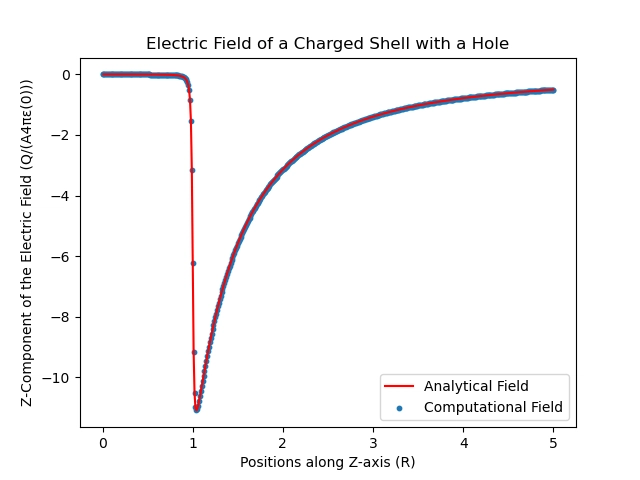
It’s pretty simple – a scatter plot and a line graph, axes, and legends. Nothing too fancy. How can we replicate this in JavaScript?
It turns out we have many options for graphing libraries. Let’s take a look at D3. It advertises itself as “the JavaScript library for bespoke data visualization,” and is also the base of several other graphing libraries, including Observable Plot (developed by the same team as D3), Vega, and Plotly (we’ll come back to that one). The fact that so many people built other projects on top of D3 should give us an idea of what we’re in for – it’s clearly very useful, but probably not so easy to use.
Some notes before we get started:
- For the purposes of this blog post we’ll skip module and script setup and skip straight to the graphing code. However, if you’d like to try following along in a Jupyter notebook, I found this sample notebook (designed for Observable Plot) helpful for getting my charts to work.
- Likewise, reading from a file is beyond the scope of the article, so we’ll assume we already have an array called
datathat has all the computational field data. - Finally, D3 creates SVGs, but I’ve snipped and embedded them as bitmaps to make things easier.
Ready for a challenge? Let’s start with the sample on the D3 Getting Started page. (I won’t paste the whole thing now, but I’ll show you what I change step by step and paste the finished product at the end).
For now, we’ll use the sample to make sure we have our environment working, and use it as a scaffolding for the rest of our project. Running it as-is gives us:
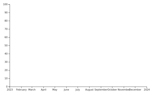
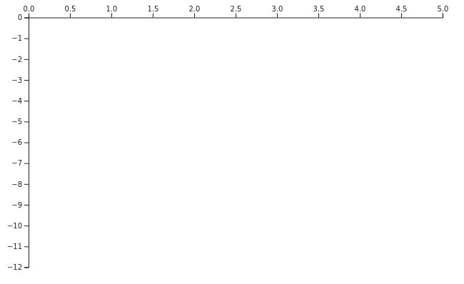
We’ve proven we can draw something, at least. We’ve also learned that D3 works by creating each element of the graph – in this case, the x- and y-axis – and then appending all of those elements to an svg, which we then display. Let’s start by changing out x-axis to be linear, rather than dates, and adjusting our y-axis domain to fit out data. We can also move the x-axis to the top:
// Declare the x (horizontal position) scale.
const x = d3.scaleLinear()
    .domain([0, 5])
    .range([marginLeft, width - marginRight]);

// Declare the y (vertical position) scale.
const y = d3.scaleLinear()
    .domain([-12, 0])
    .range([height - marginBottom, marginTop]);

// Add the x-axis.
svg.append("g")
    .attr("transform", `translate(0,${marginTop})`)
    .call(d3.axisTop(x));
The axes look pretty good so far. Now we need some way to create a line graph and a scatter plot, plus add titles for the axes and the whole chart. Let’s move over to the Line Chart tutorial linked to from the D3 website.
It looks like we can add labels to our axes by appending text and setting the attributes appropriately. A little guessing and checking on positioning, plus a quick search on rotating text in an SVG, gives us:
// Add the x-axis.
svg.append("g")
    .attr("transform", `translate(20,${marginTop+40})`)
    .call(d3.axisTop(x))
    .call(g => g.append("text")
         .attr("x", width / 2)
         .attr("y", -30)
         .attr("fill", "black")
         .text("Positions along Z-axis (R)"));

// Add the y-axis.
svg.append("g")
    .attr("transform", `translate(${20+marginLeft},40)`)
    .call(d3.axisLeft(y))
    .call(g => g.append("text")
         .attr("fill", "black")
         .attr("transform", "rotate(-90)")
         .attr("x", -90)
         .attr("y", -30)
         .text("Z-component of the Electric Field"));
That gives us our axis labels. We can add a title to the chart the same by appending text directly to the svg instead of to one of the axes:
svg.append("text")
    .attr("fill", "black")
    .attr("x", width / 2 - 125)
    .attr("y", 15)
    .text("Electric Field of a Charged Shell with a Hole");
That looks reasonable. I don’t like that I had to center the title by eye – there must be a better way. But for now let’s move on to actually graphing our data. First we need to clean up our data. We ultimately want arrays of objects that we can deconstruct to get x and y values. (Note that due to a division by zero problem for z = 0, we’re slicing off the first entry in the analytic field.)
const R = 1, degCos = Math.cos(Math.PI / 180);

let eOfZ = function(z) {
    return -2 * Math.PI * ((R + z)/(z*z*Math.pow((z*z + R*R + 2*z*R), 0.5))-(R-z*degCos)/(z*z*Math.pow((z*z+R*R-2*z*R*degCos), 0.5)))
}

let eFieldComputational = [];
let eFieldAnalytic = [];

for (let i = 0; i <= 500; i++) {
    let z_i = i/100;
    eFieldComputational.push({
        z: z_i,
        E: data[i]
    });
    eFieldAnalytic.push({
        z: z_i,
        E: eOfZ(i/100)
    });
}

eFieldAnalytic = eFieldAnalytic.slice(1);
Now let’s try the line generator and line path (still from the line chart example):
// Declare the line generator.
const line = d3.line()
    .x(d => x(d.z))
    .y(d => y(d.E));

// Append a path for the line
svg.append("path")
    .attr("fill", "none")
    .attr("stroke", "red")
    .attr("stroke-width", 1.5)
    .attr("transform", "translate(20,40)")
    .attr("d", line(eFieldAnalytic));
I had to manually adjust the position of the curve to match where I had moved the axes. The SVG doesn’t know or care that it’s supposed to be a graph with real mathematical meaning, and will let you put any element wherever. This could easily lead to highly misleading graphs, either through error or malice, so be attentive!
Now we just need to plot the computational field as a scatter plot (preferably underneath the curve). We have another example to refer to, which leads us to:
// Add a layer of dots
svg.append("g")
        .attr("stroke", "blue")
        .attr("stroke-width", 1.5)
        .attr("fill", "none")
        .attr("transform", "translate(20,40)")
    .selectAll("circle")
    .data(eFieldComputational)
    .join("circle")
        .attr("cx", d => x(d.z))
        .attr("cy", d => y(d.E))
        .attr("r", 1.5);
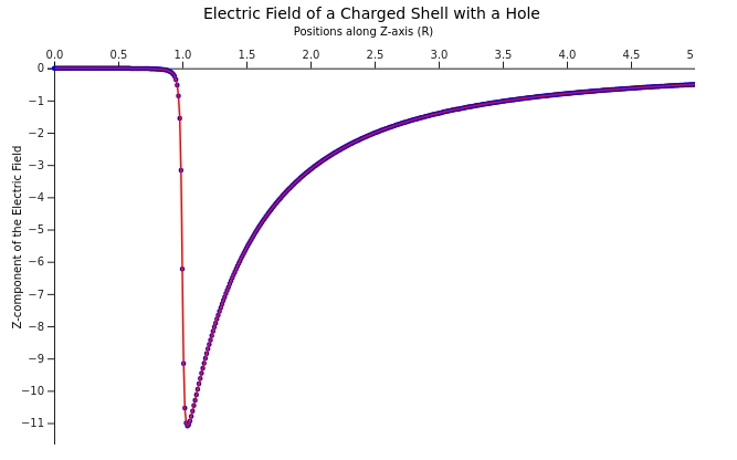
So that is a complete graph. It could certainly use some polishing. Somewhere along the line I cut off the ends of the axes, probably while shifting the positions to make room for the axis labels. The original graph had a legend, but I’m not brave enough to face more text nodes. And I don’t feel like this is really “my” code – it’s a Frankensteined mix of example codes until I got something that fit my purposes.
To recap, our final, complete graphing script is:
// Declare the chart dimensions and margins.
const width = 640;
const height = 400;
const marginTop = 20;
const marginRight = 20;
const marginBottom = 30;
const marginLeft = 40;

// Declare the x (horizontal position) scale.
const x = d3.scaleLinear()
    .domain([0, 5])
    .range([marginLeft, width - marginRight]);

// Declare the y (vertical position) scale.
const y = d3.scaleLinear()
    .domain([-12, 0])
    .range([height - marginBottom, marginTop]);

// Create the SVG container.
const svg = d3.create("svg")
    .attr("width", width)
    .attr("height", height);

// Declare the line generator.
const line = d3.line()
    .x(d => x(d.z))
    .y(d => y(d.E));

// Add the x-axis.
svg.append("g")
    .attr("transform", `translate(20,${marginTop+40})`)
    .call(d3.axisTop(x))
    .call(g => g.append("text")
         .attr("x", width / 2)
         .attr("y", -30)
         .attr("fill", "black")
         .text("Positions along Z-axis (R)"));

// Add the y-axis.
svg.append("g")
    .attr("transform", `translate(${20+marginLeft},40)`)
    .call(d3.axisLeft(y))
    .call(g => g.append("text")
         .attr("fill", "black")
         .attr("transform", "rotate(-90)")
         .attr("x", -90)
         .attr("y", -30)
         .text("Z-component of the Electric Field"));

svg.append("text")
    .attr("fill", "black")
    .attr("x", width / 2 - 125)
    .attr("y", 15)
    .text("Electric Field of a Charged Shell with a Hole");

// Add a layer of dots
svg.append("g")
        .attr("stroke", "blue")
        .attr("stroke-width", 1.5)
        .attr("fill", "none")
        .attr("transform", "translate(20,40)")
    .selectAll("circle")
    .data(eFieldComputational)
    .join("circle")
        .attr("cx", d => x(d.z))
        .attr("cy", d => y(d.E))
        .attr("r", 1.5);

// Append a path for the line
svg.append("path")
    .attr("fill", "none")
    .attr("stroke", "red")
    .attr("stroke-width", 1.5)
    .attr("transform", "translate(20,40)")
    .attr("d", line(eFieldAnalytic));

// Append the SVG element.
container.append(svg.node());
I could use this – I could save it, and use it as a starting point every time I need a new graph. That’s actually pretty similar to the way I use Matplotlib – most of my graphs are descendants of the code I provided, which is itself a descendant of the Matplotlib documentation and whichever tutorials I happened to find in 2019. But tweaking a couple of parameters in my Matplotlib code – and knowing that, all else aside, at least my data points will align with the axis – is a lot less of a hassle than appending elements to an SVG one by one.
Let’s try Plotly. No particular reason – it was one of the first things I found when I searched for “JavaScript graphing library” so I’ve been curious about it since. Plotly is “[b]uilt on top of d3.js and stack.gl,” so hopefully it’ll take care of a lot of things that made the last chart such a pain. Conveniently, they have one tutorial that covers both line and scatter plots. We do need to restructure our data into arrays of x and y values rather than objects, but that’s not so bad.
let z_values = eFieldComputational.map(data => data.z);
let computational = eFieldComputational.map(data => data.E);
let analytic = eFieldComputational.map(data => data.E);
let computationalTrace = {
    x: z_values,
    y: computational,
    mode: 'markers',
    type: 'scatter'
};

let analyticTrace = {
    x: z_values.slice(1), //the analytic solution had a problem at z = 0
    y: analytic,
    mode: 'lines',
    type: 'scatter'
}

let plotlyData = [computationalTrace, analyticTrace];

Plotly.newPlot('plotlyContainer', plotlyData);
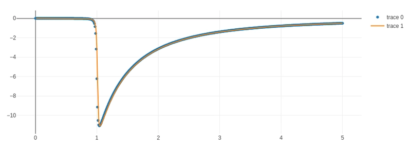
Well.
It’s not perfect – I haven’t put labels, for one thing – but I think the brevity of the code speaks for itself.
There’s a lot to be said for learning D3. It’s certainly very powerful, and I’m sure understanding it would make learning any graphing library built on top of it trivial by comparison. And I admit some of the example graphs (like this gorgeous star map) have enchanted me. But for capping off a project that I’ve already spend countless hours on, and just want to present my results and be done? Let’s just say I’m happy D3 isn’t my only choice.