Fix mobile keyboard overlap with VisualViewport
Introduction
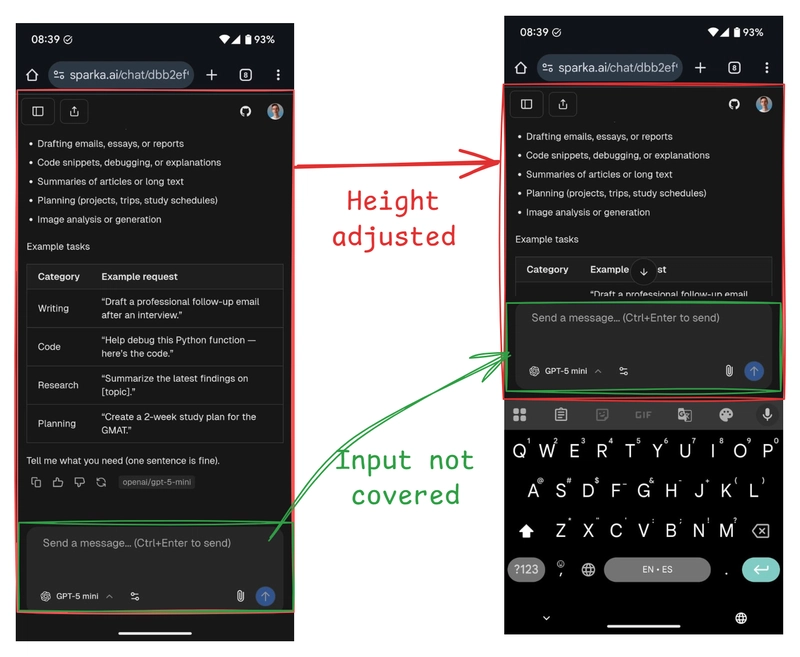
Bottom‑pinned chat inputs get buried when the mobile keyboard opens. The page visually shrinks, but neither vh nor dvh track the virtual keyboard. Your input ends up underneath the keyboard.
To solve this, we can use the VisualViewport API to sync the visual viewport height to a CSS variable.
I hit this building Sparka. The fix is in the Sparka GitHub repo if you want a real‑world reference.
What partially helps (but isn’t universal)
You’ll see this referenced and it’s correct in spirit:
<meta
  name="viewport"
  content="width=device-width, initial-scale=1.0, interactive-widget=resizes-content"
/>
Chromium/Android supports it. iOS Safari doesn’t consistently honor interactive-widget=resizes-content yet. Relying on it alone won’t keep your layout keyboard‑safe on iOS.
The robust fix
Use the Visual Viewport API to mirror the actual visible height into a CSS variable (for example --app-height). Then consume that variable instead of dvh/vh.
1. Tiny client component to sync --app-height
// components/viewport-resize-observer.tsx
'use client'

import { useEffect } from 'react'

export function ViewportResizeObserver() {
  useEffect(() => {
    function updateAppHeight() {
      try {
        const height =
          typeof window !== 'undefined' && 'visualViewport' in window && window.visualViewport
            ? window.visualViewport.height
            : window.innerHeight
        document.documentElement.style.setProperty('--app-height', `${height}px`)
      } catch {}
    }

    updateAppHeight()
    const vv = typeof window !== 'undefined' ? (window as any).visualViewport : undefined
    if (vv && typeof vv.addEventListener === 'function') {
      vv.addEventListener('resize', updateAppHeight)
      vv.addEventListener('scroll', updateAppHeight)
    }
    window.addEventListener('resize', updateAppHeight)

    return () => {
      if (vv && typeof vv.removeEventListener === 'function') {
        vv.removeEventListener('resize', updateAppHeight)
        vv.removeEventListener('scroll', updateAppHeight)
      }
      window.removeEventListener('resize', updateAppHeight)
    }
  }, [])

  return null
}
2. Mount it once (Next.js app/layout.tsx)
// app/layout.tsx (snippets)
import type { Metadata, Viewport } from 'next'
import { ViewportResizeObserver } from '@/components/viewport-resize-observer'

export const metadata: Metadata = { title: 'Your App' }

export const viewport: Viewport = {
  maximumScale: 1,
  // interactiveWidget: 'resizes-content', // optional; iOS Safari not universal
}

export default function RootLayout({ children }: { children: React.ReactNode }) {
  return (
    <html lang="en" suppressHydrationWarning>
      <body>
        <ViewportResizeObserver />
        {children}
      </body>
    </html>
  )
}
3. Use the variable instead of dvh
// components/chat.tsx (snippet)
<div className="flex h-[var(--app-height,100dvh)] min-w-0 flex-col">
  {/* fallback keeps layout sane if the var isn’t set yet */}
</div>
Using it in isolation for any full‑height container:
<div className="h-[var(--app-height,100dvh)]" />
Why it works
-
Truth source:
visualViewport.heightreflects the post‑keyboard visible height. -
CSS variable: We mirror that value to
--app-heightso layout follows the real visual viewport.
Progressive enhancement (optional meta)
Keep the viewport meta for platforms that support it. It improves behavior on Android/Chromium and doesn’t hurt iOS.
export const viewport = {
  maximumScale: 1,
  interactiveWidget: 'resizes-content' as const,
}
In the wild
This approach is used in Sparka.ai. See the source at https://github.com/franciscomoretti/sparka.