Drop-in spinner for any Angular 17+ button (no CSS imports): ngxsmk-button-spinner
Drop-in spinner for any Angular 17+ button (no CSS imports): ngxsmk-button-spinner
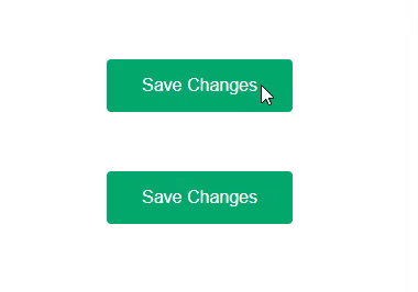
Add a loading spinner to any existing
<button>with one attribute.
No component swap. No global stylesheet. SSR-safe. A11y-friendly.
✨ What it is
ngxsmk-button-spinner is a tiny Angular 17+ directive that overlays a spinner on your button during async work.
- ✅ Drop-in:
[ngxsmkButtonSpinner]="loading" -
✅ Two modes
- Inline (default): spinner appears after the text with a small gap
-
Overlay (centered):
[ngxsmkButtonSpinnerHideLabel]="true"
-
✅ Zero CSS imports — styles are injected once
-
✅ CSS variables theming (bind directly in the template)
-
✅ A11y:
role="status", configurablearia-label -
✅ SSR-safe
🧩 Install
npm i ngxsmk-button-spinner
Peer deps: @angular/core@>=17, @angular/common@>=17.
🚀 Quick start (Signals)
// app.component.ts
import { Component, signal } from '@angular/core';
import { NgxSmkButtonSpinnerDirective } from 'ngxsmk-button-spinner';

@Component({
  selector: 'app-root',
  standalone: true,
  imports: [NgxSmkButtonSpinnerDirective],
  template: `
    <button [ngxsmkButtonSpinner]="saving()" (click)="save()">
      Save
    </button>
  `
})
export class AppComponent {
  saving = signal(false);

  save() {
    this.saving.set(true);
    setTimeout(() => this.saving.set(false), 1200);
  }
}
That’s it. No module boilerplate. No style imports.
🎛️ Theming (recommended): bind CSS variables directly
Bind these CSS variables right on the button for instant updates (no restarts, no object cloning):
-
--ngxsmk-color(spinner color) -
--ngxsmk-track(trail color, defaulttransparent) -
--ngxsmk-thickness(2px,3px, …) -
--ngxsmk-size(20px,1.2em, …) -
--ngxsmk-speed(700ms,450ms, …)
Inline (default)
<button
  [ngxsmkButtonSpinner]="loading"
  [style.--ngxsmk-color]="'#0ea5e9'"
  [style.--ngxsmk-thickness]="'2px'"
  [style.--ngxsmk-size]="'22px'"
  [style.--ngxsmk-speed]="'600ms'">
  Publish
</button>
Overlay (centered, text hidden)
<button
  [ngxsmkButtonSpinner]="loading"
  [ngxsmkButtonSpinnerHideLabel]="true"
  [style.--ngxsmk-color]="'#0ea5e9'"
  [style.--ngxsmk-thickness]="'6px'"
  [style.--ngxsmk-size]="'20px'"
  [style.--ngxsmk-speed]="'500ms'">
  Save
</button>
Prefer variable binding over passing a theme object — it updates immediately with Angular HMR/Signals and avoids change-detection gotchas.
You can also set per-class defaults:
/* component.css */
.primary-btn {
  --ngxsmk-color: #2563eb;
  --ngxsmk-thickness: 3px;
  --ngxsmk-size: 22px;
  --ngxsmk-speed: 450ms;
}
🧠 API (tiny)
<button
  [ngxsmkButtonSpinner]="loading"         <!-- boolean or Signal<boolean> -->
  [ngxsmkButtonSpinnerHideLabel]="true"   <!-- optional overlay mode -->
  [ngxsmkButtonSpinnerOptions]="{ ariaLabel: 'Saving' }">
  Save
</button>
-
ngxsmkButtonSpinner: boolean | Signal<boolean)— toggles spinner; also disables the button. -
ngxsmkButtonSpinnerHideLabel?: boolean | Signal<boolean)— overlay mode when true. -
ngxsmkButtonSpinnerOptions?: { ariaLabel?: string }— a11y label for the spinner.
♿ Accessibility
- Spinner uses
role="status"with anaria-label(default: “Loading”). - Button is disabled while loading to prevent duplicate submissions.
- Overlay mode hides the label visually but keeps the status for screen readers.
🌐 SSR / hydration
The directive injects DOM only in the browser after view init. Toggle loading in response to user actions or browser-only effects.
🛠️ Troubleshooting
-
Theme not updating
Bind CSS variables directly ([style.--ngxsmk-*]). This updates instantly without rebuilding. -
Spinner not centered in overlay
Ensure the button doesn’t clip positioned children withoverflow: hidden. -
Text not hiding in overlay
Upgrade to the latest build — the label is wrapped and hidden safely.
📦 Links
- GitHub: https://github.com/toozuuu/ngxsmk-button-spinner
- npm: https://www.npmjs.com/package/ngxsmk-button-spinner
If you build something with it, drop a comment — I’d love to see it!